
If you’ve recently returned from a multi-decade, extrasolar vacation, or, like me, you’ve been too busy doing other things to notice, you might not have heard of ‘fluid typography’.
Fluid typography is a fancy way of describing font properties, such as size or line height, that scale fluidly according to the size of the viewport.
Why is it good, and why should I bother to pay attention? Very astute question!
Taking font size as an example, when a site’s font sizes are fluid, it means they will adapt to every change in screen size, for example, by growing larger as the viewport width increases, or smaller as it decreases.
Contrast that idea with properties that respond to specific viewport sizes, such as those defined by media queries, but do nothing in between. (By the way, if you’ve never Googled or debated with strangers on the internet about perfect CSS break points, then you’ve lived a good life.)
The potential benefit of fluid typography is that it permits us finer control over how properties such as font size appear at every screen size, not just at specific “mobile”, “tablet” or “desktop” breakpoints, whatever they happen to represent at the time.
Fluid typography is not just type hype: it’s been around for a while. There is a fluid typography approach for every design with some taking into account minimum and maximum viewport widths, others not, some using calc(), others clamp().
Given that resounding endorsement, now is as good a time as any to bring it to Gutenberg
Well, that’s the plan.
The plan
When introducing a new feature to Gutenberg, especially one that impacts site design, there are as many considerations as there are fluid typography clamp formulae.
Here are some:
- It’s preferable to limit the amount of new
theme.jsonproperties, and where we do introduce new ones, to make those properties easy to understand. - We need consider how theme authors will apply fluid typography to specific entities such as elements or blocks.
- How much flexibility should we provide? For example, should we allow both built-in and custom clamp calculations? What about varying size units?
- We also need to balance this flexibility with future usage and potential backwards compatibility
should things everwhen things change. - Finally, which customization controls, if any, do we need in the Block Editor?
It’s very easy to become dizzy when contemplating all the variables. It’s fortunate I’m mostly always sitting down.
Hence, I find it’s much healthier to start with modest goals that will instruct further development and exploration, and, furthermore, prevent unnecessary stupefaction.
With that in mind, let’s kick things off with the following constraints:
- Introduce fluid font sizes only.
- For starters, we’ll have little or no user interface in the editor: fluid font sizes will be activated and tweaked via theme.json.
Theme.json – the font of all settings
There’s nothing preventing theme authors from entering any type of fluid font size value for any element or block right now.
Here’s an example from the TwentyTwentyTwo theme.
"fontSizes": [
    ...
    {
        "size": "clamp(1.75rem, 3vw, 2.25rem)",
        "slug": "x-large"
    }
]
The example above displays the settings.typography.fontSizes array within theme.json.
fontSizes, by the way, is one of several presets.
Using the items in this array, Gutenberg generates CSS vars for use across the theme, for example:
-wp--preset--font-size--x-large: clamp(1.75rem, 3vw, 2.25rem)
Also, these items determine the values displayed in the editor via the font size typography control.
If we are to introduce fluid typography, our mission is to retain the possibility of allowing any font size value (and therefore any fluid font size expression) but also offer an implementation behind the scenes so that users can plug in some numbers to achieve a uniform effect across their sites.
To get there, we’ll need to extend the theme.json API with a few more properties.
Okay… rubbing hands… for every font size, let’s create an additional property to house our fluid typography variables:
"settings": {
    ....
    "typography": {
        "fluid": {
            "min": "768px",
            "max": "1600px"
        },
        "fontSizes": [
            {
                "size": "2rem",
                "fluidSize": {
                    "min": "1.8rem",
                    "max": "2.5rem"
                },
                "slug": "medium",
                "name": "Medium"
            }
        }
}
Note the new properties settings.typography.fluid and settings.typography.fontSizes.fluidSize, both of which contain the following properties:
min– Influid, the minimum viewport width, influidSize, the minimum font size.max– Influid, the maximum viewport width, influidSize, the maximum font size.
The min and max settings in settings.typography.fluid could be optional should we devise appropriate fallbacks.
So, what prodigious feats can we perform with such properties I hear no-one asking?
Firstly, we can use this information to construct a unique clamp() formula for every font size. The formula will control how a font scales between minimum and maximum values, relative to the viewport width.
Just what this mysterious formula might be is still subject to experimentation and open for debate, but for the purposes of this post, let’s pretend that it’s working fabulously.
What’s more, if we’re missing some pieces, such as a minimum or maximum font size value, which are required to reliably roll our nifty clamp() formula, we could return an alternative font size value using CSS max() or min() accordingly.
Seeing as we haven’t messed with the current typography properties folks can still use size to define a font size however they please, and both will be available in the editor immediately via the font size UI control.
What’s next
A challenge will be to make the implementation generic enough to tweak, but not specific enough so that, if we ever make changes to the algorithm it will break sites.
For example, we’d want to avoid the situation whereby theme authors find themselves fiddling with their font sizes to accommodate Gutenberg’s implementation only to find that they look terrible as soon as the system environment changes, whether via disabling fluid type or changing the CSS formulae.
Hopefully we’d insure against this situation by way of baby step iterations. In the current pull request, the proposal is for no user-facing controls during the first stage. Fluid typography controls live exclusively in theme.json.
The rationale is that we are able test our API choices at the theme-level first, then let any lessons guide how we express fluid typography in the UI.
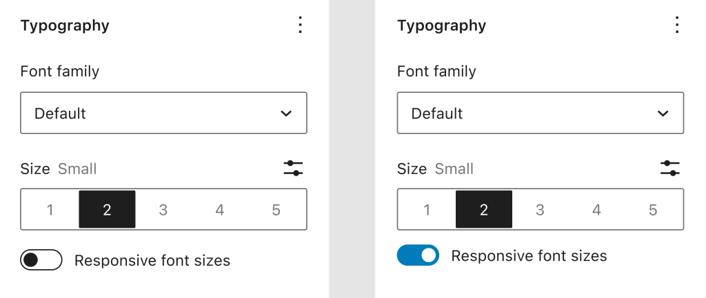
One such UI expression could be to exploit the fact that size and fluidSize properties can live alongside each other. This opens up the possibility of adding a UI toggle.
Thinking beyond, fluidity doesn’t need to stop at font sizes, or even typography either. Our next stop might be to create fluid line heights or letter spacing, all of which will one day peacefully co-exist in a world where individual blocks, layout and block patterns are fluid out of the box.
Much of this article was inspired by the clumsy stabs at various solutions I took in Github, and the reasoning, for better or worse, from the pull request discussions. The useless cynicism and bottom-of-the-barrel quips I drew from nowhere in particular.